My music video for Tonight I Let You Go by The Colours was greatly influenced by real media products. Forms and conventions are especially significant in the pop genre, and we tried to conform to these while also challenging them in some areas. Music videos, such as Subterranean Homesick Blues by Bob Dylan and Bitter Sweet Symphony by The Verve were big focuses in my research, and aspects of this research were reflected in my final music video.
I am going to split this question into several parts, each concerning a specific aspect of mise-en-scene. These parts are:
Music Video:
Location
Narrative Structure
Lighting
Sound
Performers
Costume
Camera Angles
Transitions
Print Productions:
Digipak
Panel 1
Panel 2
Panel 3
Panel 4
Magazine Advert
Music Video
Location
The locations of my music video use many forms and conventions of real media products from the pop genre. The main locations used, contemporary housing estates, are recognisable to my target audience of teenagers. This is partly due to estates being a common place for my target audience to grow up in modern times, and also because of the way estates are commonly used in shows such as the soap opera Neighbours, which have a similar audience of teenagers (as well as an adult audience).
The show Neighbours uses a relatively small and enclosed housing estate location as the setting for storylines involving jealousy, affairs, heartbreak, betrayal and more - themes that are present in the lyrics of Tonight I Let You Go by The Colours, the track for my music video. The line "Their guilty hearts still bleed" shows these kinds of themes - in this case, guilt is the primary theme of the line.
The majority of the locations in my music video are in either an estate-like or urban area (with estate-like locations being used the most, as previously mentioned). There are variations throughout the music video, and this variation runs parallel to the theme of the main character's progression in the music video.
When he leaves the house, and starts his journey to become someone who is mature and responsible for his actions, we see him walking through a typical estate. This shows slight progression, but the main change is when he reaches the end of the street. At this point a montage of traffic and traffic lights is used to show the change of his state of mind - instead of standing still and letting life pass, he is starting to actively try to change his life (the change from a red light to a green light shows this). From here, the locations are much more interesting and diverse, with trains, urban areas, and underpasses being some of the locations used. The locations used are an important signifier of the boy's mental state. At the end of the video, he has become mature, caring, and responsible - to use a cliché, he has become a man - and this is shown by the location of the girl's house, which is the opposite of the comfort zone that is his house.
We chose to use a narrative based on the idea of a journey because it would tie into the theme of the boy walking in the music video. We use many shots of the boy walking, and this is where all of the ideas for progression came from. The idea of walking itself was inspired by music videos such as Not The Only Person by The Rumble Strips, adverts such as Football Evolution, and clips such as Control Hate.
In addition, I used Subterranean Homesick Blues as an inspiration for not only the lyric cards section of my music video, but the location it was set in as well. We modernised the iconic images of the music video for Subterranean Homesick Blues by using a texting teenager instead of Allen Ginsberg dressed as a Rabi working in the background, cars and roads instead of a building site, and a red postbox as a symbol of contemporary Britain. The texting teenager, cars and roads, and red postbox are recognisable symbols of the current time period in Britain, just as the symbols used in Subterranean Homesick Blue represented that time period. By modernising the imagery used in the music video for Subterranean Homesick Blues, I have developed the forms and conventions of that real media product.
Narrative Structure
The narrative structure of my music video incorporates flashbacks. I used forms and conventions by showing these flashbacks in black and white, which is the conventional way of showing that something is a flashback. An example of this is the opening to Kill Bill Vol. 2, where the opening scene - which is set in the past - is in black and white.
I also developed the forms and conventions of flashbacks by combining the standard black and white flashback with other effects. In the sequence of flashbacks concerning the history of the relationship between the main character and the girl, I overlayed a sped-up Point Of View shot of an urban, squared concrete path. This helped add a sense of time to the flashbacks, which were showing the events over the time of the relationship themselves. It also made the images more striking and memorable due to the unique nature of the effect.
Another way I developed, and partly challenged, forms and conventions of flashbacks were by combining the flashbacks with the possibility of dream shots. Dream shots are often represented by a noticeable change of imagery, commonly with black and white. Some of the black and white parts of my music video could imply either a flashback or a dream - specifically, the opening sequence in the boy's house and the final shot where a shot of the boy in bed fades the ending into black and white. The former could be a flashback or dream of a safe, conservative past as he leaves the house, and the latter could show that the whole narrative was simply the boy dreaming. This develops and challenges the conventional, simple way in which flashbacks are used in most real media texts by supplying an open ending that could be interpreted in more than one way, as in the film Inception - in Inception, the dream world is shown through a spinning top that can never stop spinning, and the end of the film shows the top spinning in a way that could be judged as continuously spinning or about to fall just after you seemingly see him return to reality.
In addition, I also used black and white for the lyric card section of my music video. As the lyric card section of the music video appears separate to the main narrative, just like the traffic/traffic light sequence, this use of black and white makes this part of music video look like a flashback or dream. The sense of uncertainty over what the black and white represents again shows how my use of narrative both develops forms and conventions (adding layers to the flashback/dream idea) as well as challenges them (adding a sense of intrigue over what the effects I have used mean - this engages the viewer).
The use of black and white also strengthens the intertextual reference to the music video for Subterranean Homesick Blues, which is also shot in black and white.
Lighting
When moving between these flashbacks/dream sequences and the shots in "reality", I had to ensure that the transition was obvious. To do this, I used a change in colour and/or lighting between the flashback/dream sequences and reality sequences.
In the relationship flashback sequence, I used fade to white effects at the start and the beginning of the sequence to show the change from reality to flashback. White is commonly used to show the border between reality and what is not reality - e.g. Heaven is almost always shown as predominantly white, and even popular films such as Harry Potter and the Deathly Hallows Part 2 show the place after reality - in this film it is named "limbo", as it is often referred to - as a pure, white area.
I used the convention of showing the gap between reality and what is not reality as white to ensure that anyone viewing my music video would easily identify the transitions between reality and the flashback/dream sequences.
Furthermore, I used the transition between black and white and colour to show the transition from the opening shots in the house to the rest of the music video. This shows the change in mentality that the change in location itself shows. The boy is leaving the boring, safe house - his regretful and inactive state of mind - and going into the vibrant and opportunity filled world - his mature, responsible state of mind where he is improving his life himself. The contrast between the black and white and the colour is striking an emphasises the change from a dream-like state to the real world.
Sound
The use of diegetic sound to construct a sense of reality is common in real media texts. An example of diegetic sound establishing a bond between the viewer and a character(s) is the infamous chase scene in the sewers in The Third Man, where the sounds of the rushing water and footsteps (as well as many other pieces of diegetic sound) help to absorb you into the scene and feel like you are actually there with the characters.
Performers:
I have heavily used forms and conventions of the pop genre in terms of my performers. The two main performers, the boy and the girl, are both white teenagers. Performers -and the artists - in the pop genre are usually young, to enable the target audience of teenagers to relate to the figures they are shown. White is the ethnicity associated with the pop genre, due to the dominance of this ethnicity in the genre.
I did not challenge the convention of women being objectified in the genre, either - while it was partly due to the limited availability of the performer, I have only a few shots of the girl in our music video, and she is always shown as the trophy for the boy to collect at the end of his journey - the boy is the one who shows development throughout the music video. The representation of the girl doesn't fall into the voyeurism often seen in music videos - as described by Goodwin - such as Nicky Minaj's Starships music video, however. So, overall, I used the conventions of the pop genre by not showing the girl as a powerful figure, but I did develop the forms and conventions slightly by not showing her in a completely voyeuristic state.
 I also used several cultural signifiers to show the Britishness of the performers. The stand-out scene is the lyric card scene, where I use the cars, road, texting teenager, and red postbox as cultural signifiers of contemporary Britain. I have used forms and conventions of Britishness by using these things, which are identifiable with contemporary Britain. The aspect of Britishness is a big part of the marketing of British pop artists, such as Jessie J; Jessie J usually associates herself with big British events, such as the Diamond Jubilee Concert and the London 2012 Olympics Closing Ceremony. Marketing images such as the one on the right also prove how the aspect of Britishness is a significant part of her marketed image.
Costume
The costumes used in my music video use, but also develop, form and conventions of the pop genre. The costume used for the main character, the boy, uses the conventions by using a look that resembles the fashionable, high street look. The suit that he wears casually is similar to the sort of fashionable image that is sold by shops such as Topman. This look is used by bands such as Maroon 5, which is a similar band to The Colours. You can see the similarity below - both our main performer and Maroon 5 use casually worn suits as a costume/look.
The rest of the costume is, again, similar to the other image of Maroon 5 in that the main performer of my music video is wearing casual clothing underneath the suit. This allows the average teenager - my music video's target audience - to relate to the performer. Overall, the costume of the main performer - the boy - uses forms and conventions of the pop genre.


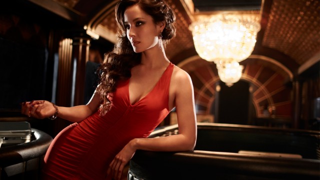
 However, the costume of the girl in my music video (shown on the left) develops the forms and conventions of the pop genre. The red jumper connotes the aspect of love in her character, and makes her appear as the femme fatale of the music video. Red is commonly used in a femme fatale's costume - an example of this is in the latest James Bond film, where the femme fatale (the character's name is Sévérine - she is shown on the right) is shown through red dresses and lipstick. By using the red jumper, which is emphasised by the contrast between it and the black trousers, I have created extra layers to the character. This is a development of forms and conventions of the pop genre, which usually contain costumes that do not develop the artist(s) and/or performer(s) - they are there to show off the character. Also, by using a red jumper, instead of a voyeuristic costume (as seen often in the pop genre, see the Nicki Minaj video above), I have developed the forms and conventions of how women are portrayed in the pop genre.
Camera Angles and Movement
I replicate many iconic camera angles in my music video - therefore, I am using the forms and conventions of real media products that are related to mine. On the other hand, I have developed a few of these shots - for example, I have modernised the iconic shot of Subterranean Homesick Blues, as aforementioned, by modernising it.
Examples of shots I have replicated, and also developed in some way, are:
-When the boy leaves the room at the start of my music video, the shot of just his feet is similar to the opening of Kill Bill Volume 1, where you see only the feet of Bill. In my music video, the casual clothing makes this more suited to the pop genre.
-The shots of the boy walking down the street are similar to the walking shots in the music video for Bitter Sweet Symphony by The Verve, where the main performer walks down the street.
-While not necessarily a shot, the montage or urban shots at the end is inspired by the montages I have looked at in my research, such as the infamous montage in Battleship Potemkin. The urban environments modernise the montage in a similar way to how I have modernised the iconic shots of the music video for Subterranean Homesick Blues in my music video by using symbols of contemporary Britain - a texting teenager, roads and cars, modern costumes, and an estate location.
In summary, I mainly used forms an conventions of real media products in order to replicate their effects in my music video, but I also slightly developed them by bringing them into the context of the time and genre.
Transitions
My music video uses a large amount of quick transitions. While I use the slower and more gradual cross dissolve, dip to white, and dip to black effects a few times to achieve certain connotations, I mainly use quick cuts (I also used a wipe effect after the splitscreen effect in my music video, but this was also a quick effect). This is to ensure that the audience does not become bored or uninterested - in the pop genre, the visuals of the music video is very important as you are targeting a young audience that can be easily distracted. For example, the music video for Hall of Fame by The Script - a track from the pop genre - contains a large amount of quick cuts to keep the audience engaged.
This music video also uses these transitions frequently due to the short nature of each clip. Keeping the majority of the clips short also helps to keep the audience interested in the music video, for the same reasons as the transitions.
I have used the forms and conventions of the genre heavily in this aspect of my music video. I have developed the forms and conventions of transition slightly by using slower effects such as cross dissolve, but these are much less common than the quick transitions I have used.
Print Productions
Digipak


Also, I used other aspects of the text to use and develop forms and conventions of real media products from the pop genre. The fonts I have used both use and develop these forms and conventions, as while the font of the logo for The Colours is similar to the font for the logos of, for example, Lady Gaga and Coldplay, The font for the rest of the front panel - and most of the other panels - is a more unique creative font that again sets the digipak apart while having the more generic parts of other aspects of the digipak to sustain the link to the pop genre. As well as this, the creative style of the font is emphasised by the way I have made the name of the album, Tonight, look like graffiti on the garage in the background of the image. Overall, I have used many conventions of real media products in the pop genre while still developing the genre in a few ways.


Digipak
I have used the conventional layout of the medium for the layout of my digipak as I have used the 4-panel layout used frequently in the pop genre. I have used this to improve the link between my digipak and other digipaks in the pop genre.
Panel 1
For the first panel of my digipak, I developed conventions of digipaks in the pop genre by using a combination of stylish black and white imagery and the striking band logo to catch the attention of my very visually-orientated audience of teenagers. The black and white visuals are a reference to the narrative of my music video, which uses flashbacks and dream-like sequences. I also used a creative paintbrush like effect to make the image seem more distinct and make it stand out if it was next to a standard pop genre digipak. These black and white images are contrasted by the pink logo for The Colours, which subsequently stands out. While the logo itself conforms to genre forms and conventions, when used alongside the black and white image it becomes striking and is different to most digipaks from the pop genre. For example, some bands I have named as similar bands to The Colours use bright colours constantly in their digipaks, and my use of black and white would stand out if my digipaks front panel were compared to these digipaks. An example of this is shown below, where the front panel of my digipak is compared to one of the front panels of the digipak for Mylo Xyloto (the album has reversible cover art) by Coldplay, a similar band to The Colours.

Panel 2
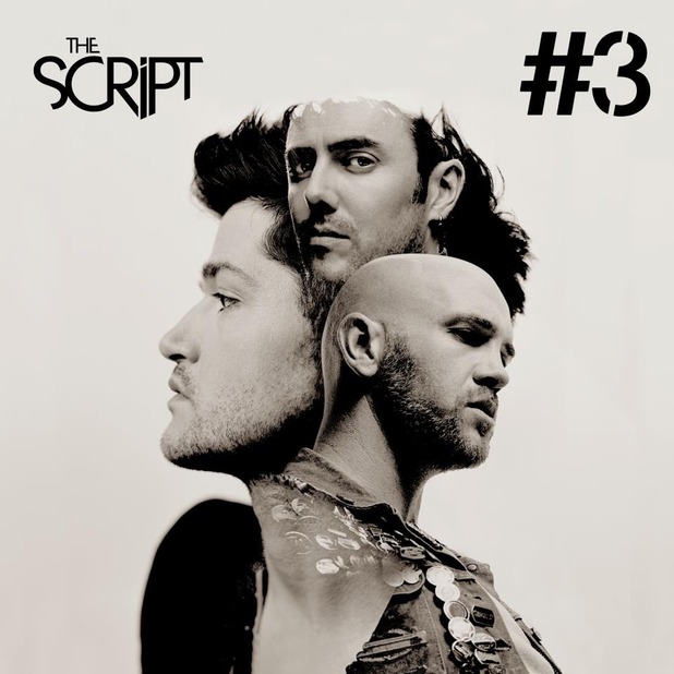
I have used a visual narrative in my digipak, which in itself develops forms and conventions of similar media products. The pop genre rarely deviates from the standard design of having the content of each panel relatively confined to that panel, with the digipak for #3 by The Script being an example of this (see the image below). This visual narrative is constructed by showing different locations that the boy has walked through in the music videos as different panels in the digipak. These walking shots - all showing him walking from the left of the panel to the right of the panel to make sure the visual narrative is clear - reflect the journey aspect of my music video that I have mentioned earlier in this post. Using my music video and print productions together like this to strengthen the connotation of a journey is a technique rarely seen in real media products from the pop genre - if you look at both the digipak for #3 by The Script and the music video for the main track of the album (Hall of Fame) below, the theme of the main track is not reflected in the digipak. In this way, I have developed the forms and convention s of real media products in the pop genre.
The image used for panel 2 of my digipak shows the transition from black to white - from a flashback or dream-like state to reality. As my digipaks first panel uses black and white mainly, then the second uses black and white and colour, and the 3rd and 4th panels use colour, the use of colour also reflects the aspect of a journey from wallowing in the past to seizing the present - just like in my music video. Again, this is a development of how a theme of a music video is represented in a digipak in the pop genre. My use of quotes in this panel, however, uses forms and conventions of the pop genre by utilizing positive quotes from famous sources of pop music - 4Music and MTV.

Panel 3
In panel 3 of my digipak (shown on the right), I have used the train shot as it was a very effective location in my music video, and so it was a great shot to use to further show the aspect of a journey.
Panel 4
Once again, I use another iconic walking shot to show the theme of a journey in my music video. In this panel, though, there are a few more noteworthy inclusions.
I have used aspects of real media products in the pop genre with the use of social media. Teenagers, my target audience, use social media heavily nowadays, and so including link to The Colours' website, Facebook and Twitter pages is crucial in the marketing of the band. As the front and back panel are the ones viewable when the digipak is on sale, putting these links of the back of the digipak - panel 4 in this case - allows people to pick the digipak up and see the link to these pages without en buying it. This can lead to them visiting these pages, becoming interested, and then purchasing items such as the digipak because of this.
Furthermore, I have developed the forms and conventions of how track lists are displayed.While I have listed the tracks on panel 4, as you would expect from a digipak in the pop genre, I have placed the tracks on shapes that resembles the lyric cards from my music video for Tonight I Let You Go. This creates a link between my music video and digipak in a similar way to how the visual narrative is used, again developing the forms and conventions of track lists in music videos, which usually use text exclusively (see the track list for Coldplay's Mylo Xyloto digipak, a digipak from a band I have stated to be similar to The Colours).
 The bright colours of the lyric cards also appeal to my target audience of teenagers in a similar way to my logo for The Colours, as teenagers are often affected largely by visual things, and the pop genre is associated with bright colours - e.g. the bright pink HMV logo and the vibrant digipak for Maroon 5's Overexposed digipak (showed on the left). My use of colours is therefore a use of forms and conventions of the pop genre.
In addition, I also used forms and conventions of real media products when adding a barcode to panel 4 of my digipak. The barcode signifies the difference between the digipak and the magazine advert - the digipak is a product, while the magazine advert is a marketing tool. Without a barcode, the digipak loses its purpose as a media product - it is meant to be bought with the CD - the music - to increase the aesthetic appeal of the product and emphasise the themes of the brand. As aforementioned, the magazine advert is different as it is purely for marketing - the digipak is for both marketing and distribution. This leads me into the section of my advert that concerns the magazine advert.
I have used aspects of real media products in the pop genre with the use of social media. Teenagers, my target audience, use social media heavily nowadays, and so including link to The Colours' website, Facebook and Twitter pages is crucial in the marketing of the band. As the front and back panel are the ones viewable when the digipak is on sale, putting these links of the back of the digipak - panel 4 in this case - allows people to pick the digipak up and see the link to these pages without en buying it. This can lead to them visiting these pages, becoming interested, and then purchasing items such as the digipak because of this.
 |
The bright colours of the lyric cards also appeal to my target audience of teenagers in a similar way to my logo for The Colours, as teenagers are often affected largely by visual things, and the pop genre is associated with bright colours - e.g. the bright pink HMV logo and the vibrant digipak for Maroon 5's Overexposed digipak (showed on the left). My use of colours is therefore a use of forms and conventions of the pop genre.In addition, I also used forms and conventions of real media products when adding a barcode to panel 4 of my digipak. The barcode signifies the difference between the digipak and the magazine advert - the digipak is a product, while the magazine advert is a marketing tool. Without a barcode, the digipak loses its purpose as a media product - it is meant to be bought with the CD - the music - to increase the aesthetic appeal of the product and emphasise the themes of the brand. As aforementioned, the magazine advert is different as it is purely for marketing - the digipak is for both marketing and distribution. This leads me into the section of my advert that concerns the magazine advert.
Magazine Advert

My magazine advert uses and develops forms and conventions in a very similar way to the front panel of my digipak, which is fitting given that they are both big representations of the brand (with the magazine cover being a large and important way of marketing and the front panel of my digipak being the fist thing people see when they look at my digipak).
There is a contrast between the bright logo that represents the band, The Colours (as well as the way I have used forms and conventions of real media products from the pop genre with the font and colour of the logo, as aforementioned), and the black and white image that represents the way I have developed forms and conventions of real media products from the pop genre with techniques such as an interesting and interpretable narrative and lyric cards.
By combining all these aspects together I associate myself with the pop genre - through the logo for The Colours - while also showing how I have developed certain aspects of the genre through lyric cards and the use of black and white in the narrative. I have developed these forms and conventions of real media products in the pop genre - just like in my digipak, showing these parts of my music video in my magazine cover strengthens the effectiveness of these techniques as well as the link between my music video and my print productions. This leads me directly to Question 2.
By combining all these aspects together I associate myself with the pop genre - through the logo for The Colours - while also showing how I have developed certain aspects of the genre through lyric cards and the use of black and white in the narrative. I have developed these forms and conventions of real media products in the pop genre - just like in my digipak, showing these parts of my music video in my magazine cover strengthens the effectiveness of these techniques as well as the link between my music video and my print productions. This leads me directly to Question 2.
No comments:
Post a Comment